
Top 10 tips for making Easy Read information
By Inacia Rodrigues
Have you ever thought about how many people struggle to understand written information?
Read our top 10 tips to help you make your information clear and easy to understand.
For people with a learning disability, complex language, long sentences and cluttered layouts can create unnecessary barriers to everyday information.
When information is hard to understand, it can prevent people from accessing services, making decisions, or getting the support they need. The good news is that this is something we can change.
Our 10 tips will help you apply key Easy Read principles about words, images, layout, and accessibility.
You can use these tips when creating leaflets, reports, websites, training materials, or any public information.
Getting started
Before you make your information in Easy Read, it’s important to understand the accessibility needs of the people the information is for.
Will everyone reading your information be people with a learning disability? If not, will you produce two versions of the information, or will everybody get the Easy Read version?
Not all information needs to be in Easy Read. Accessibility means different things for different people. Some people may need:
- Easy Read.
- Plain English
- Large print.
- Braille
- Audio or video formats.
The key is to think about what your audience needs and not to assume.
How will people use the information?
Think about how people will receive your information. Also, what do you want then to do after reading it?
Think about:
- Does your document require action? For example, if you’re giving people a form or survey that they need to complete and return.
- What support is in place if they get stuck?
If action is needed, people shouldn’t have to guess what comes next. Make sure people know:
- What they need to do.
- When they need to do it.
- How they can do it.
Clear next steps help people feel confident about what to do.
Top 10 tips for creating your own Easy Read content
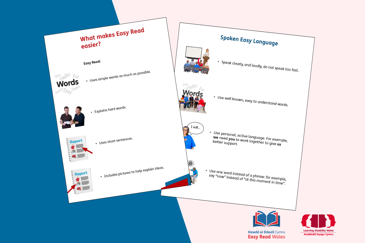
1. Use short, simple sentences
Purpose: Reduce the burden of reading!
- Stick to key points.
- Use everyday words that are familiar and easy to understand.
- Keep sentences short, aim for around 12 to 15 words to each sentence.
- Use 1 idea or topic per paragraph.
- Write in the active voice, for example – if you need help, call us!
2. Explain important or difficult words
Purpose: Make meaning clear for more readers.
- Explain any words that the reader may not know.
- Avoid jargon and technical language.
- Don’t assume prior knowledge.
If you’re stuck, try to find a way to explain a difficult word that you can’t avoid:
- Check synonyms
- Google it!
- Look at recent, existing Easy Read information – you can see ours here: Recent work
- Use our hard words dictionary
3. Plan a clear structure
Purpose: Help readers follow the information easily.
- Organise your content in a logical and easy to follow structure.
- Use clear sections, like who wrote the document, who the document is for, what it is about, what next.
- Clear headings help readers find information quickly and make longer documents easier to follow.
4. Use readable fonts
Purpose: Improve legibility.
- Use one clear font throughout the document. Use a sans serif font like Arial, Century Gothic or FS Me Pro.
- Use a minimum of 16-point font size for Easy Read. If you are writing for people who use large print, use a minimum of 20.
5. Emphasise text clearly
Purpose: Highlight key information without confusion.
- Use bold text to highlight important words.
- Use bullet points, lists, or text boxes.
- Do not use Italics or BLOCK CAPITALS.
6. Use images to support meaning
Purpose: Reinforce understanding.
- Use a cover image that helps explain what the document is about.
- Use images that match your text next to every paragraph. Images should give readers a clue or a good idea about what the text is about to say.
- Use high quality images, that are clear to see, when printed and viewed digitally.
- Use trusted image libraries. Some are paid options and some free. Examples of paid options: Photosymbols, Adobe Stock, Shutterstock, Unsplash, Pexels
7. Use strong colour contrast
Purpose: Improve readability for everyone.
- For most people, black text on a white or pale background is most accessible.
- You can use other accessible colours. Use a colour contrast checker to test contrast ratio of your background and foreground colour for accessibility.
8. Keep your design simple and user-friendly
Purpose: Reduce visual clutter.
- Use lots of white space between paragraphs and margins, and generous line spacing.
- Always left align all text.
- Supporting images should be placed to the left of the text.
- Do not use hidden tables for layout – they mess with the digital accessibility of a document.
- Read our Clear and Easy handbook for design tips.
9. Make your document accessible from the start
Purpose: Build accessibility into your day to day working practice.
- Thinking about accessibility right from the start saves time and resources and includes everyone.
- Knowing who your audience is and where they will get the information will help you reach the people you need to.
- Printed information needs to have high resolution images and should be easy to find or request.
- Digital information needs to work well for people using different types of assistive technology, such as screen readers, magnifiers or keyboard navigation.
- Make sure your document has a clear heading structure and is exported as an accessible PDF where appropriate.
10. Test your document with people
Purpose: Ensure real-world understanding.
- Ask people to read and test your writing and design. You could ask your colleagues to check your work.
- Whenever possible involve people with a learning disability. Their lived experience provides valuable feedback that others may miss. Pay people fairly for their time and expertise. Plan time for consultation!
- Use tools such as Check it! Check it! is part of our Clear and Easy Handbook.
Bonus tip: Get expert support when you need it
Creating high-quality Easy Read takes specialist writing, design and accessibility skills. If you’re unsure where to start, an experienced Easy Read team can help with planning, writing, design or reviewing your documents.We can support you in writing Easy Read content or can make it for you. Don’t forget to check our free resources: Resources
Why Easy Read matters
We regularly hear from people with a learning disability that they prefer information in Easy Read format.
Research shows there are around 1.5 million people with a learning disability in the UK. That’s a lot of people who may be excluded when information is not presented in an accessible way.
At Easy Read Wales, we strongly believe that everyone has the right to understand information, especially information that could affect people’s lives.
Easy Read helps people:
- Understand information more easily.
- Make informed choices.
- Feel more included and independent.
In some cases, organisations are legally required to provide accessible information, including Easy Read, under the Equality Act 2010.
Through more than 20 years of creating Easy Read documents, we’ve seen a positive shift in how people think about Easy Read when providing any information.
More organisations and services are recognising the importance of making their information easier and more accessible to people. You can see some of our recent Easy Read work here: Recent Work.
What to do next
Creating an Easy Read document takes time, care and attention to detail. We hope these 10 tips and ideas in this blog have shown you what to focus on the most.
The most effective Easy Read documents are developed with people who will actually use them. Whenever possible, involve people with a learning disability in your process.
Helpful links
Resources from Easy Read Wales:
Accessibility resources:
Need support?
If you’d like support creating or improving Easy Read documents, we’d love to hear from you.
Email us at [email protected].
Whether you need advice, document reviews or fully designed Easy Read projects, we’re happy to help you make your information clearer and more accessible.
 English
  Welsh
Welsh